;
;
This concept goes far beyond designing a simple logo or choosing a few random colors; visual identity is actually an integrated and systematic set of visual elements that a brand uses to introduce itself, convey messages, display fundamental values, and create differentiation in a highly competitive market. In today's saturated world, visual identity acts as a powerful strategic tool that communicates the organization's values to the audience without the need to utter a single word, solidifying brand recognition in their minds for the long term. Research shows that humans make judgments about a product or brand within 90 seconds of their first interaction, and between 62 to 90 percent of this initial assessment is formed based solely on colors. These statistics clearly demonstrate the power and importance of visual design in commercial success and shaping consumer behavior.
A solid and cohesive visual identity builds the foundations of trust. Consistency in visual presentation conveys the message to customers that the business possesses maturity, precision, and a commitment to quality. On the other hand, visual design is the translation of brand positioning and strategy, and it should not be considered a substitute for it. In this comprehensive article, which is compiled for educational purposes, an in-depth examination of the strategic foundations prior to design, the explanation of key elements building visual identity, the step-by-step stages of creating this system, the importance of the brand style guide, and finally the latest graphic design trends in 2026 are discussed.
Strategic Foundations and Prerequisites for Creating a Visual Identity
Creating a successful visual identity must always be rooted in business strategy. Before drawing even an initial sketch or choosing a color in the palette, designers and managers must have a deep understanding of the essence of the organization, its values, and the needs of the target audience. Brand architecture, personality, brand story, and voice form the foundation of graphic decisions.
Brand Architecture and Portfolio Structure
Brand architecture defines how different brands are organized and connected within an organization, directly impacting the visual strategy. In the "Branded House" model, such as IBM, the corporate brand dominates all products, and the visual identity is identical and continuous across all subsidiaries. In contrast, the "House of Brands" model, such as Procter & Gamble (P&G), includes a collection of independent brands like Tide and Gillette, each of which has a completely different visual identity, personality, and target audience. Also, the "Endorsed Brands" model, like Microsoft, adopts a hybrid approach where the parent brand lends credibility to the products, but their relative visual independence is maintained. The selection of each of these models determines whether the visual elements should be completely unified or allow for high variability.
Purpose, Story, and Core Values
Every decision in visual identity design must reflect the ultimate goal of the organization. The brand's reason for being (Purpose), its origin story, and guiding principles (Values) shape the identity foundations of the business. Expressing the brand story and the reason behind its naming gives meaning to the visual elements and provides a platform for emotional connection. For example, if innovation and transparency are among the core values of a tech company, these concepts should be reflected in the choice of bright colors, modern typography, and the use of whitespace in the design.
Brand Personality and Tone of Voice
Brand personality is a set of human characteristics attributed to a business, regulating the feeling the audience receives when interacting with the brand. For instance, the Atlassian brand defines its personality with traits like boldness and optimism, whereas Figma emphasizes traits like curiosity, playfulness, and honesty. These personality traits directly translate into the Tone of Voice, which complements the visual identity. If the brand has a serious and authoritative personality, classic typography and dark colors are appropriate choices; however, a playful and friendly brand needs energetic colors and curved forms.
Audience and Competitor Analysis
Visual identity is designed to communicate with audiences, not merely to satisfy the personal tastes of the organization's managers. A precise understanding of the audience persona, their pain points, and aspirations allows for the creation of an identity that connects with them on a subconscious level. Simultaneously, visual analysis of competitors is absolutely vital for finding opportunities for differentiation. Examining the dominant color palettes in the industry, typography styles, and how competitors use images reveals how to appear distinct in a crowded market while avoiding copying that destroys brand authenticity.
Key Elements and Building Blocks of the Visual Identity System
Visual identity is an interconnected system formed by placing several distinct yet harmonious elements together. The effectiveness of this system depends on the harmony among its components.
The Logo as an Identity Anchor
The logo is the most recognized and fundamental part of a brand's identity. This element acts as the face of the brand and must encapsulate the story, personality, and commitments of the collection in a minimal and powerful graphic form. A successful logo must be simple, scalable, and memorable, retaining its readability and appeal both on massive urban billboards and as a small mobile app icon. Details in logo design play a storytelling role; just as the hidden arrow in the FedEx logo signifies speed and precision, or the arrow from A to Z in the Amazon logo implies unmatched product variety and customer satisfaction. The geometric forms and shapes used in the logo also carry a deep psychological weight. Circular shapes inspire a sense of community, evolution, and comfort, whereas angular and sharp forms indicate dynamism, energy, excitement, and sometimes danger.
Color Palette and Color Psychology
Colors have a highly powerful psychological language and are considered the fastest route to evoke emotions in the audience and solidify the brand name. Consistent use of a distinct color palette can increase brand recognition by up to 80 percent. The choice of colors should be rooted in psychology; the color blue in brands like Facebook evokes a sense of trust, harmony, and loyalty, while green is tied to nature and tranquility, and red, like Coca-Cola, represents timeless excitement, passion, and joy.
Designing a professional color palette requires selecting one to three primary colors for establishing identity, a set of secondary colors to create depth and variety, and neutral colors (such as gray or cream) to create balance in backgrounds. Accurate documentation of color values in various spaces, including the RGB system for digital displays, CMYK for printing devices, HEX codes for web development, and the Pantone system for physical products, is absolutely mandatory to prevent any visual inconsistency.
Typography as the Visual Voice
Typography involves the selection, design, and arrangement of fonts, acting as the graphic voice of the brand. The type of font chosen can instantly convey the mood of the brand to the viewer. Serif fonts, which have small decorative strokes at the ends of letters, usually convey a sense of expertise, antiquity, tradition, and credibility, whereas sans-serif fonts represent modernity, simplicity, and a more accessible approach. Standard typography structure in a brand includes choosing display fonts for headlines, highly readable fonts for long texts and body copy, and establishing a precise visual hierarchy.
Imagery, Textures, and Graphic Elements
Illustration, photography style, patterns, textures, and icons shape the overall atmosphere of the brand and make abstract concepts tangible. The style of images a brand uses should be strongly aligned with its values. Brands seeking to instill a sense of transparency and intimacy generally use natural light photography and real subjects, while luxury brands might turn to high-contrast studio images. The use of custom graphics, repeating patterns, and customized icons on packaging or websites adds deeper layers to the visual identity and strengthens its cohesion.
To provide a structured understanding of the constituent elements of visual identity, their details and essential parameters are explained in the table below:
| Core Design Element | Role and Function in Visual Identity | Items to be Documented in the Guide |
|---|---|---|
| Logo System | A distinct graphic symbol that solidifies values and brand recognition at a glance. | Color and monochrome versions, clearspace rules, minimum allowed size, and design don'ts. |
| Color Palette | Creating rapid emotional and psychological connection through specific light spectrums. | Breakdown of primary, secondary, and neutral colors along with HEX, RGB, CMYK, and Pantone codes, and contrast ratios. |
| Typography | The visual voice of the brand that conveys the tone of voice through the shape and weight of letters. | Primary and alternative web font families, headline hierarchy, line spacing, and readability standards. |
| Imagery Style | Conveying the overall atmosphere of the brand through photos, illustrations, and videos. | Color temperature of photos, camera angles, extent of filter usage, and copyright rules. |
| Iconography | Complementary elements for enriching the user interface and product packaging. | Line thickness of icons, degree of edge curvature, and how patterns combine with backgrounds. |
Step-by-Step Stages in the Visual Identity Creation Process
Creating an effective and distinctive visual system requires going through a structured process. This process begins with deep research and ultimately ends with implementation and compiling the guideline rules.
Step One: The first step involves research, discovery, and building an inspirational foundation. Designers should examine a range of competitors and leading brands to create a "mood board". These emotional boards involve collecting images of colors, fonts, packaging, and textures that reflect the desired brand personality. This process greatly helps in discovering the trends dominating the market and identifying opportunities for differentiation.
Step Two: In the second step, based on the strategy and approved mood boards, designers enter the phase of creating visual concepts. Logo design begins as the central core, and then the color palette and typography family are selected to perfectly harmonize with the geometry and form of the logo. The golden rule at this stage is maintaining simplicity; a color palette consisting of three primary colors and two complementary fonts is always preferable to a cluttered and complex design.
Step Three: The third step is dedicated to integration across touchpoints. The created identity must be tested at all points where the user interacts with the brand. From the user interface design of the website and application to social media graphics, product packaging, business cards, and email signatures, the user must receive a homogeneous, continuous, and harmonious experience across all these portals.
The Importance and Structure of the Brand Style Guide
Even the most brilliant and beautiful visual identities will face chaos over time and due to the application of various individuals' personal tastes if there are no codified and precise rules for their use. The "Brand Style Guide" is a comprehensive strategic document that clearly defines the rules for using the visual and verbal elements of the brand for internal employees, developers, advertising agencies, and business partners. This document guarantees cohesion, which is the foundation of building trust, and prevents the dilution of the brand's visual values over time.
A standard and complete style guide encompasses multiple sections so that no ambiguity remains for the implementers. This document always begins by stating the brand story, mission, and vision of the organization, because understanding the "why" behind the design makes adherence to the rules logical. In the section related to the logo, besides providing various versions, special emphasis is placed on "visual don'ts"; the visual demonstration of stretching the logo, unauthorized color changes, and placement on cluttered backgrounds serves as a highly effective guide for designers. The precise allocation of color codes and stating their usage ratios, along with accessibility and appropriate contrast guidelines for smooth reading (such as WCAG standards), is another vital part of this guide.
Today, in modern brand style guides, a dedicated section is considered for determining the tone of voice as well as guidelines for using artificial intelligence tools (AI Guidelines). With the prevalence of using generative AI in content creation, leading companies establish rules for prompt structure, tone parameters, and visual limitations so that machine-generated content does not lose its connection with the soul and personality of the brand.
New Trends in Graphic Design and Visual Identity in 2026
The world of graphic design and branding is constantly evolving. In 2026, after years of absolute dominance by highly minimal, sterile, and flawless digital approaches, we are witnessing a fundamental paradigm shift toward expressive, emotional, organic, and 3D designs. Recognizing these trends helps brands maintain a modern and appealing approach while preserving authenticity.
Return to Raw, Imperfect, and Human Design (Naive Design)
A natural reaction to the hyper-fast and flawless productions of artificial intelligence is the creation of a thirst for authenticity and the human touch. In 2026, the Naive Design style, which includes controlled imperfections, shaky lines, grainy textures, asymmetrical shapes, and handmade typography, has garnered significant attention. This graphic style conveys honesty and intimacy to the audience, giving the message that real humans are behind this brand. Lifestyle brands, organic food industries, and creative startups abundantly use this irregular yet clever approach to stand out.
Synergy of Artificial Intelligence and Human Creativity (Hybrid Creativity)
In 2026, artificial intelligence is no longer a threat, but a powerful assistant and collaborator in the process of creating visual identity. Designers use AI not to produce the final product, but for rapid ideation, exploring new compositions, real-time color changes, and discovering unexpected forms. This hybrid approach reduces project execution time and allows designers to focus their concentration on strategy, conceptualization, and evoking emotions; a process in which AI plays the role of a production tool and humans play the role of a director and editor.
Kinetic Typography and Variable Fonts
In modern visual identities, typography is no longer a static element on paper. Motion has become an intrinsic part of words. Kinetic (animated) typography allows brands to express their rhythm, energy, and tone through the way letters move on screens. Simultaneously, the widespread use of Variable Fonts allows designers to dynamically change the width, weight, and angle of letters based on the display platform, bringing unparalleled dynamism to websites and applications and managing visual hierarchy in a lively manner.
Bold Color Palettes and Nostalgic Aesthetics
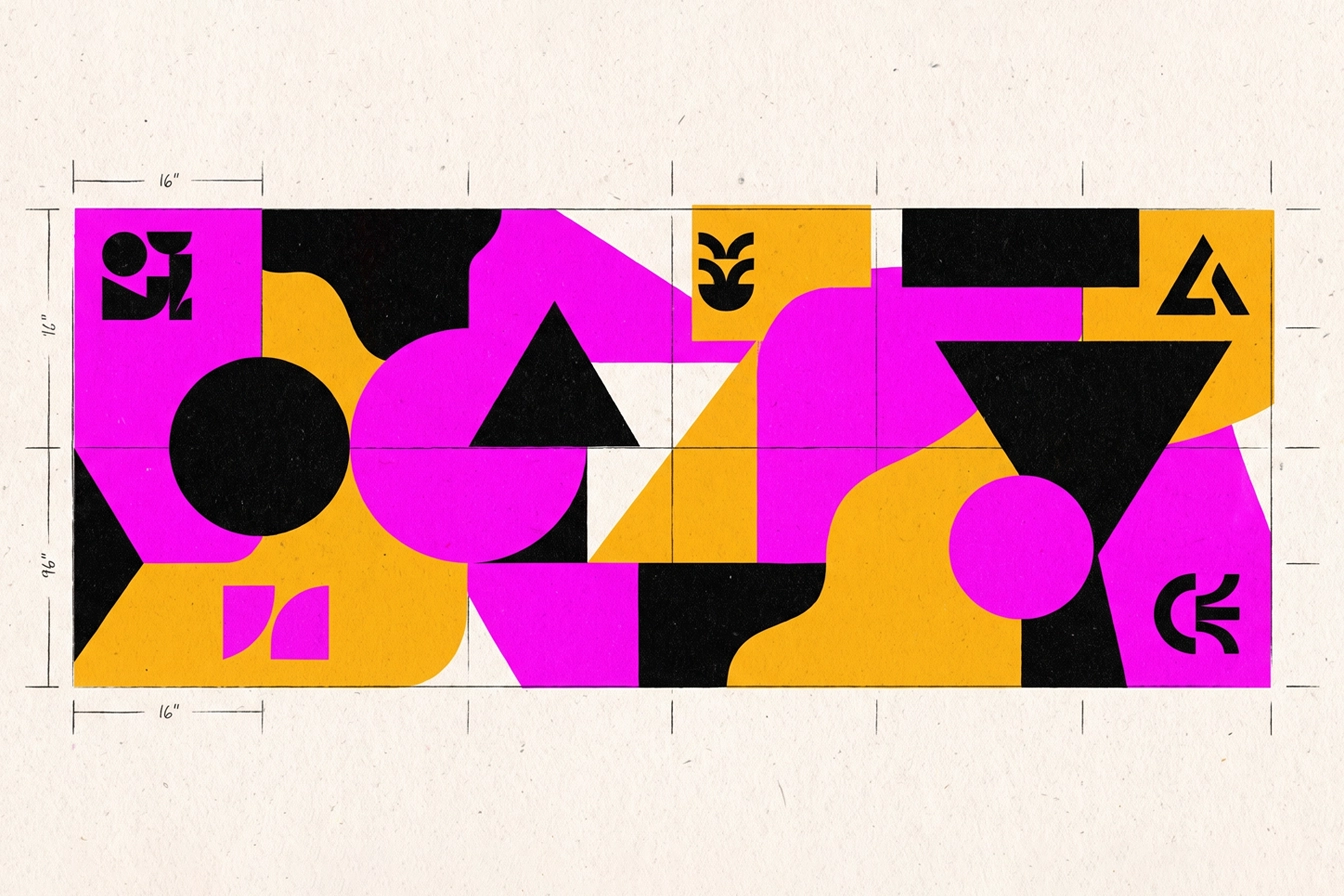
In contrast to the neutral and cautious shades of recent years, the 2026 color trend focuses on Saturation Revival and bold palettes. Neon colors, unexpected combinations, and strong Color Blocking are designed to quickly capture user attention in fast-paced digital feeds. This color boldness is often combined with Retro-Futurism aesthetics; where classic patterns of past decades merge with modern rendering quality and bold typography to offer a sense of familiarity and trust in a completely innovative format.
Multi-dimensional Visual Identities and Mixed Collages
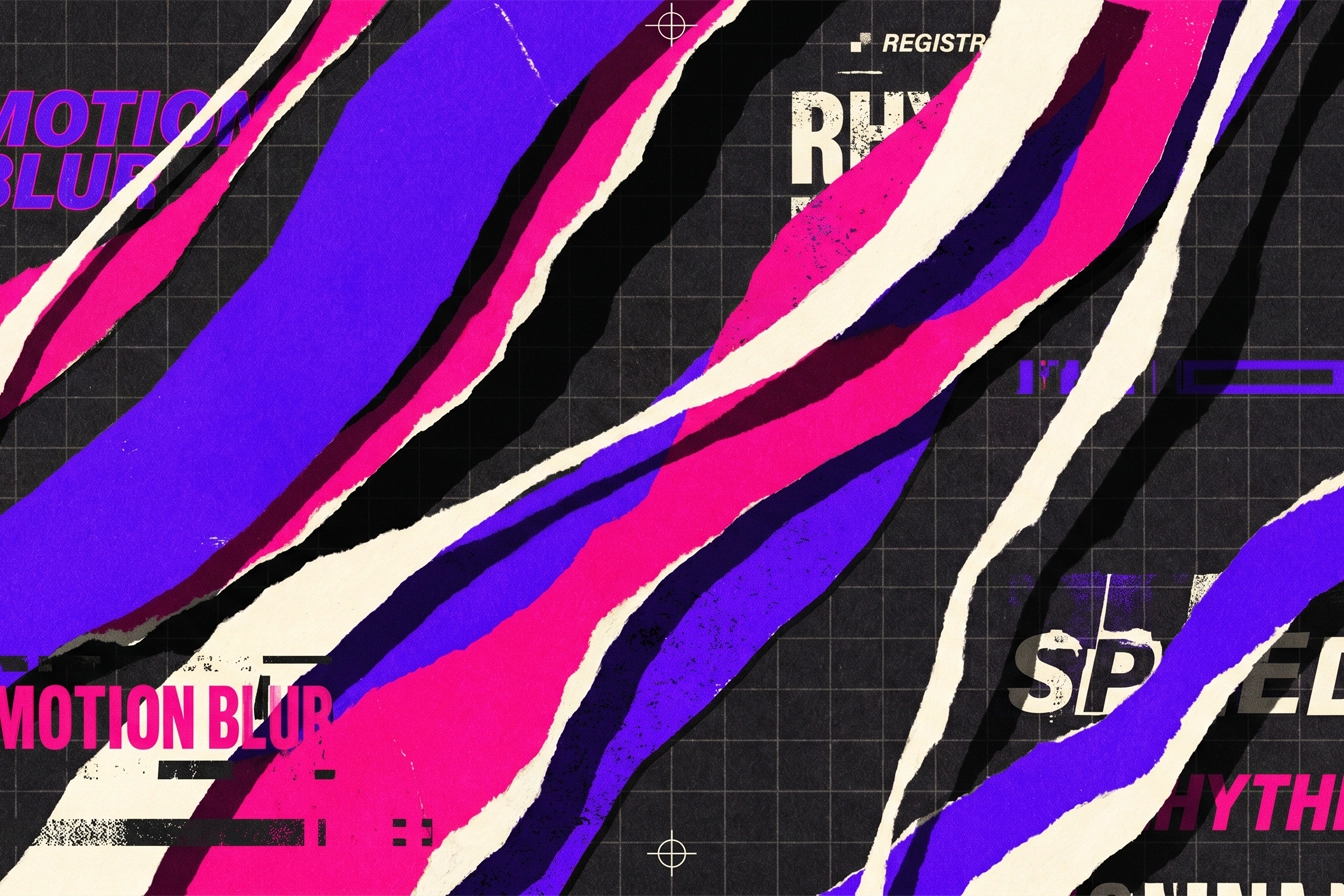
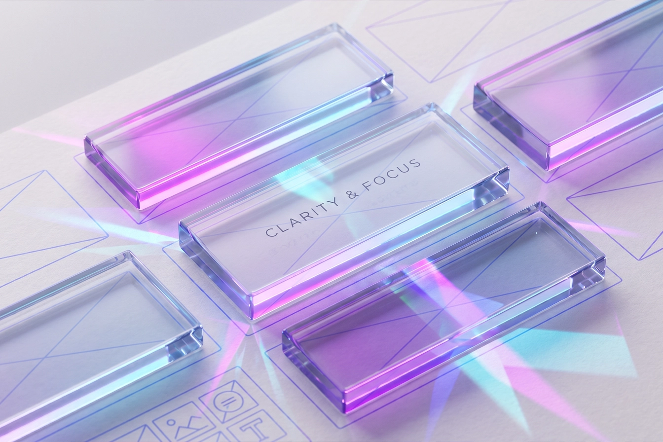
Completely flat designs are being replaced by multi-dimensional visual systems. The use of controlled 3D elements, spatial lighting, and rich layering adds high visual depth to the brand identity without making the design overly heavy. The Mixed-Media collage trend, where real photography, illustration, bold typography, and rough textures are combined, maximizes visual complexity and richness, providing an ideal platform for brand storytelling.
Conclusion
Designing and establishing a cohesive and strategic visual identity is not merely an aesthetic endeavor, but a vital and long-term investment that determines the boundaries of a business's success, influence, and longevity in the market. This process begins with a deep understanding of the brand's reason for existence and its architecture, and reaches maturity through precise psychological decisions in selecting the color palette, logo design, and typography. The existence of a detailed and comprehensive "Brand Style Guide" is the key to maintaining this systematic cohesion across all customer touchpoints and prevents the brand's image from being distorted. Ultimately, considering the fundamental transformations in graphic design in 2026—including the acceptance of organic imperfections, the integration of AI in the creative process, and the emergence of dynamic and multi-dimensional typography—brands are obligated to incorporate the necessary flexibility in their visual strategy. Only in this way can a business consistently present a modern, relevant, and appealing approach to its target audience and remain memorable in their minds, while maintaining its authenticity and stability.