;
;
In today's world, websites serve as the core and command center of businesses, conveying the identity, values, and business strategies of organizations. The success of a website is not measured solely by aesthetics, but is the outcome of a perfect balance between utility and usability, which ultimately forms the fundamental concept of "usefulness." More precisely, even if a system incorporates the most powerful features theoretically, it is doomed to fail if its user interface is complex and incomprehensible. Research shows that in the competitive web space, usability is a prerequisite for survival; because if a website's homepage cannot convey its value proposition in a fraction of a second, users will quickly leave it and turn to competitors.
Understanding these complexities requires professional designers to step away from linear processes and adopt cyclical and iterative approaches. These approaches include deep user research, formulating information architecture, implementing global accessibility standards, and keeping pace with emerging technologies. The following report, by deeply examining fundamental strategies, cognitive principles, and technological trends in the years leading up to 2026, provides a comprehensive roadmap for developing scalable and human-centric digital platforms.
Architecture and Engineering of the Website Design Process
Designing an efficient digital platform requires adherence to a structured methodology. Ignoring any of the fundamental stages of this process can lead to structural challenges in the final stages, the correction of which severely increases development costs. This process begins with the discovery phase and extends to post-launch maintenance.
Research, Discovery, and Strategic Analysis
Every successful project begins with a deep discovery phase and strategic research. In this phase, macro business objectives, precise audience personas, and the competitive market landscape are scrutinized. Market research helps designers identify user behavioral patterns and their expectations. Using analytical tools to examine the content structure and technologies used by competitors reveals opportunities for differentiation. User research is also conducted through interviews and analysis of analytical data to discover audience pain points and hidden motivations. For example, if data indicates that users of an educational platform have trouble maintaining learning continuity, designers can incorporate features such as progress reminders as a competitive advantage into the system's architecture.
Information Architecture and Structural Planning
After analyzing the data, the planning stage for organizing information begins. In this step, the sitemap is developed as a macro visual guide to clearly outline the hierarchy of pages and their relational logic. The primary goal of the sitemap is to minimize the number of clicks required to access vital information. Concurrently with this stage, wireframes, which are skeletal outlines without visual details, are created to determine the placement of key elements such as navigation menus, forms, and call-to-action (CTA) buttons. These preliminary designs allow the development team to optimize the user flow logic and ensure the smoothness of conversion paths before spending time on graphical details.
Content Strategy and Textual Integration
Content consistently plays a pivotal role in website success, and the visual design must act as a vessel serving this content. The content creation process involves drafting clear texts, optimizing the SEO structure, and producing visual assets. Texts must be written considering users' visual scanning patterns; using short paragraphs, descriptive headings with a logical structure (H1 to H6), and targeted keywords not only improves search engine rankings but also enhances readability for human users. Designers must strictly avoid using complex marketing jargon and ambiguous phrases that increase the user's cognitive load. Furthermore, images and multimedia content must be selected and optimized in a way that rapidly conveys the brand message without disrupting page loading speeds.
Visual Development and User Interface (UI)
In the visual design phase, approved wireframes are transformed into live user interfaces using design systems. The selection of color palettes, typography, icon styles, and spacing must be completely aligned with the brand identity. Establishing a strong visual hierarchy at this stage is essential so that the visitor's eyes are subconsciously guided toward the most important page elements, such as registration forms or purchase buttons. Maintaining visual consistency across all pages and utilizing familiar design patterns increases user trust and reduces their confusion when interacting with the system.
Technical Development, Quality Assurance, and Deployment
At this stage, developers convert the visual designs into scalable code in both the frontend and backend sectors. Implementing responsive design as an absolute standard ensures that the user interface adapts properly across all devices of various dimensions. After development, the quality assurance (QA) phase is conducted with rigorous stress tests, checking the health of all links, forms, loading speeds, and cross-browser testing. Resolving functional bugs before final deployment prevents damage to the brand's reputation. The process does not end with launching the site; continuous error monitoring, content updates, and running A/B tests to continuously improve conversion rates form a perpetual cycle.
Usability Psychology and Cognitive Principles on the Web
Usability is a qualitative metric that evaluates the ease of user interaction with the user interface. According to research by the Nielsen Norman Group, allocating a budget equivalent to 10 percent of the total project costs to usability evaluations can significantly elevate optimal quality indicators. The correct approach in this area is to avoid expensive one-off studies and replace them with small, frequent tests and iterative design.
Usable design is built upon heuristics that reduce cognitive load and put system control in the user's hands. For instance, the system should always clearly display its current status to the user and inform them of the outcomes of their actions through rapid visual feedback. Moreover, the design must match the real world; using everyday terminology instead of complex technical error codes and providing constructive solutions to resolve errors are obvious principles of this domain.
Homepage Engineering
The homepage is the most sensitive user touchpoint with the brand. An inappropriate design of this page will quickly cause the user to exit. One of the most vital elements on the homepage is the presence of a tagline that indicates at first glance what company the website belongs to and what value it creates. Disruptive innovations on the homepage often backfire; users prefer platforms to follow common navigation standards so they do not need to relearn how to work with the site.
Furthermore, the excessive use of animations, auto-moving carousels, and videos that play without user permission must be strictly avoided. These moving elements cause severe distraction, create a feeling of intrusive advertising, and even induce dizziness in some users. For content-rich sites, embedding a clear search box with a minimum width of 27 characters is mandatory so users can conduct precise searches without parts of their keywords being hidden.
Optimizing Interactive Forms
Web forms are critical conversion points, and any friction in them translates to losing a customer. Observing psychological principles in form design directly impacts business revenue. Some of the most important form optimization principles are explained in the table below:
| Form Optimization Principle | Psychological and Practical Reason | Correct Implementation Method |
|---|---|---|
| Single-Column Layout | A multi-column structure disrupts the linear eye movement path and causes visual confusion. | Placing all fields in a vertical column, except for very short and related information like city name and postal code. |
| Removing Placeholders | Upon starting to type, the guiding text disappears, and the user experiences cognitive strain trying to remember the field's role. | Continuous use of clear labels above each input field. |
| Sizing the Field to the Data | Very large or small fields prevent the user from seeing their entire input, increasing the likelihood of typos. | Adjusting field width proportional to the average data length (e.g., 19 characters for city names). |
| Providing Clear and Multiple Errors | Relying solely on a color change to red is ineffective for colorblind individuals and creates ambiguity. | Simultaneous use of color, field border thickness, and explanatory solution text below the errored field. |
Digital Accessibility and WCAG 2.2 Regulatory Requirements
Web accessibility in recent years has shifted from a secondary and ethical feature to a legal requirement and a core pillar of design thinking. The World Wide Web Consortium (W3C), by releasing version 2.2 of the Web Content Accessibility Guidelines (WCAG), has formulated stricter standards, particularly to support users with cognitive, motor, and visual impairments. Adhering to these standards, in addition to reducing legal risks, directly positively impacts the site's SEO by improving the code structure and vastly expands the brand's user base.
WCAG standards are designed based on four fundamental principles, collectively abbreviated as POUR. These principles include Perceivable, Operable, Understandable, and Robust. The system must be designed so that content is perceptible to all senses (providing alt text for images and captions for videos), all functionalities are accessible via keyboard, the user interface's behavior is entirely predictable, and HTML codes are standard enough to be accurately interpreted by screen readers and assistive technologies.
Vital Changes and Indicators in WCAG 2.2
The new WCAG 2.2 version has added nine new success criteria to the previous standards that directly affect the user interface architecture. These changes are designed to create equal experiences for all segments of society. The following table provides a practical comparison of the upgraded requirements in the new version:
| Focus Area | Status in WCAG 2.1 | New Requirements in WCAG 2.2 | Implication for Developers |
|---|---|---|---|
| Target Size | Merely a recommendation to improve the mobile experience. | Transformed into an absolute requirement (Criterion 2.5.8) with a minimum dimension of 24x24 CSS pixels. | All buttons, links, and interactive icons must have sufficient spacing and dimensions for error-free tapping. |
| Dragging | There was no restriction on the exclusive use of drag-and-drop. | The necessity of providing an alternative via click or tap (Criterion 2.5.7). | Sliders and draggable elements must have alternative directional buttons or numeric fields. |
| Focus Appearance | Basic requirements existed for displaying keyboard focus. | Focus must be entirely distinct and not hidden by sticky headers (Criteria 2.4.11 to 2.4.13). | Revising the design of sticky menus and CSS styles related to focus for complete visual prominence. |
| Redundant Entry | No restriction on re-requesting information in long forms. | The system has no right to re-request information that the user has previously entered (Criterion 3.3.7). | Implementing autofill mechanisms and fetching data from previous form steps. |
Leading Trends and Paradigm Shifts in Web Design (2026)
The year 2026 marks the maturity of interactive technologies and a shift in audiences' visual tastes. After a long period of the reign of stark minimalism and unplanned experiments with generative AI, the design industry has moved towards creating platforms that are simultaneously smarter, faster, more eco-friendly, and highly human-centric.
Artificial Intelligence as a Cognitive Assistant (AI-Assisted Design)
The most crucial strategic transformation in 2026 is the precise boundary between "AI-generated" design and "AI-assisted" design. Generating complete visual elements by pressing a button has led to the emergence of a wave of monotonous, repetitive, and unoriginal designs that today's audiences quickly recognize and reject. Conversely, the AI assistance approach places human judgment and differentiation at the center. Designers use AI not as an ultimate creator, but as a powerful tool to accelerate research processes, rapidly build initial structures for testing, optimize sitemaps, and extract behavioral patterns.
Additionally, AI has brought website personalization into a new phase. Leading websites no longer offer an identical experience to all users; instead, they alter the structure of content blocks, product recommendations, and even their navigation in real-time, based on browser history, location, and individual user preferences. This deep personalization reduces the phenomenon of decision fatigue in users and significantly increases their engagement rates.
Modern Aesthetics, Variable Typography, and Purposeful Motion
From a visual perspective, 2026 marks the end of the dictatorship of straight lines and rigid geometric grids. Designers have turned to the use of organic shapes, anti-grid layouts, and soft gradients to create a friendlier and more natural atmosphere for the audience.
In the meantime, several aesthetic schools are growing in parallel, each with its own specific function. The table below demonstrates the most important visual trends and their applications:
| Aesthetic Trend | Visual and Structural Features | Strategic Application |
|---|---|---|
| Resonant Stark Minimalism | Maximizing negative space, neutral colors, and absolute focus on content without distracting elements. | Ideal for corporate websites, tech startups, and the health sector to instill a sense of trust and clarity. |
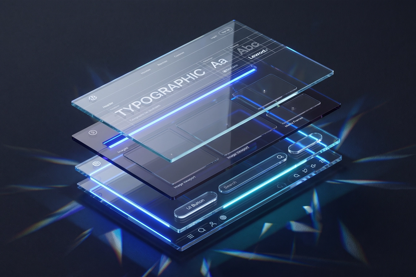
| Glassmorphism | Creating frosted glass effects, semi-transparent layers, and conveying a sense of elements floating on the background. | Suitable for inducing a sense of futurism and modernity in digital platforms and web applications. |
| Human Scribble | A blend of intentionally imperfect patterns, handwritten typography, and visual collages. | A protest reaction against flawless but soulless AI designs; suitable for creative and artistic brands. |
| Maximalism and Dial-up Delight | Using bold colors, cluttered layers, 2000s nostalgia, and intentional visual interferences. | Effective for fashion brands, music, and exciting campaigns, but highly destructive for conversion-based sites. |
Animations have also transformed from a decorative tool into a communicative one. The "Motion with Purpose" approach dictates that animations should merely be used to guide attention, indicate state changes (like form errors or loading), and storytelling. Techniques such as guided scrolling turn scrolling from a simple physical movement into a narrative journey that immerses the user in the content step-by-step without causing confusion.
Concurrently, the widespread adoption of variable fonts has created a technical revolution in web typography. In the past, using several different weights of a font required loading separate files, which slowed down the site. Variable fonts enable all weight and width variables to be summarized in just one lightweight file. This allows designers to utilize typography as a core brand differentiator without incurring technical debt and speed degradation.
Sustainable Design (Eco UX) and Environmentally Friendly Architecture
With increasing global awareness regarding climate change, the carbon footprint of digital infrastructure has received serious attention. The "Eco UX" trend seeks to reduce energy consumption in data centers and end-user devices. This goal is realized through optimizing web code architecture, utilizing ultra-compressed image formats (such as WebP and AVIF), limiting database requests, and designing dark mode user interfaces that reduce energy consumption in OLED displays. Implementing Eco UX principles is not only a social responsibility but, by drastically reducing page load times, directly helps improve Core Web Vitals and earns the satisfaction of search engines and impatient users.
Conclusion
Website design at the edge of 2026 technology is the flawless intersection of art, interaction psychology, and software engineering. Success in this domain requires moving past traditional, purely aesthetic approaches and embracing a holistic view that places human experience at the center of all decisions. Strict adherence to research processes and information architecture, coupled with a deep understanding of usability principles and evolving accessibility standards like WCAG 2.2, provides a solid foundation for any digital platform. On the other hand, intelligently integrating modern technologies such as AI assistants, variable typography, purposeful animations, and sustainable environmental architecture empowers designers to create websites that not only respond to the instantaneous needs of audiences with unparalleled speed and precision but also exhibit high resilience against the rapid changes of the digital ecosystem. Ultimately, sustainable value creation in the web space is the result of the organic bond between scalable technologies and a deep understanding of human cognitive limitations and capacities.